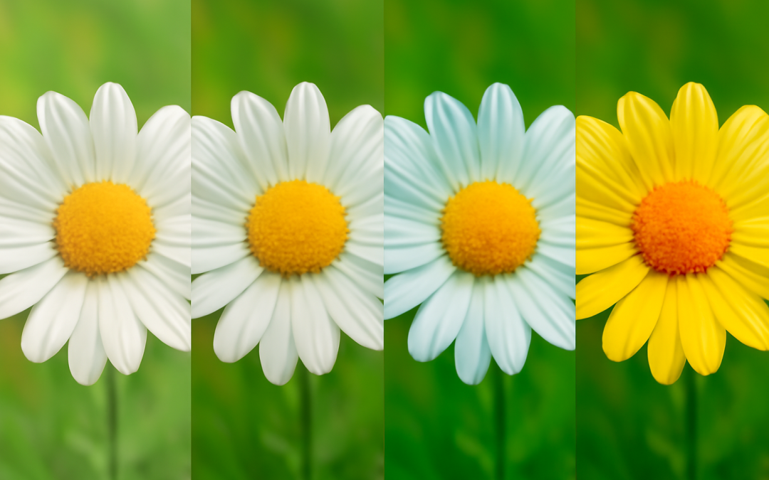
The manipulation of color properties plays a vital role in the way images are perceived, with saturation standing out as a critical factor influencing visual impact. Image saturation effects directly affect the intensity and vividness of colors within a photograph or digital graphic, altering how viewers emotionally and aesthetically connect with the content. By adjusting saturation, creators can enhance mood, emphasize specific elements, or generate entirely different visual experiences. Understanding the mechanics behind saturation and its psychological implications offers significant insight into the art and science of image creation and editing.
Saturation refers to the purity or richness of a color present in an image. When saturation levels are at their peak, colors appear intense and vibrant, exuding a sense of life and energy. Conversely, lower saturation results in muted, desaturated, or even monochromatic tones, which can convey calmness, nostalgia, or bleakness. This variability gives artists, photographers, and designers a powerful tool to direct viewer focus and evoke emotional responses. For instance, highly saturated imagery often grabs immediate attention due to its boldness, while subdued saturation may encourage deeper reflection or emphasize texture and composition in subtle ways.
In practical terms, image saturation effects can be achieved through various methods, from adjustments in camera settings to post-processing techniques in editing software. Photographers working with digital cameras might manipulate saturation by altering white balance or picture style profiles before capturing an image, setting the groundwork for the desired look. Post-capture, digital editors can apply saturation changes using sliders or curves, offering precise control over the intensity of individual colors or the entire image palette. Additionally, selective saturation adjustments allow enhancement of one or more specific hues without affecting others, a technique often employed to highlight subjects or create visual contrast within the frame.
While enhancing saturation might seem straightforward, it requires careful consideration to avoid oversaturation, which can make images appear unnatural or distorted. Oversaturated images may suffer from loss of detail as colors bleed into each other and become uncomfortable to view. This artificial look can undermine the authenticity of a photograph and lessen its emotional impact. In contrast, undersaturation can render images dull and lifeless, potentially failing to capture viewer interest altogether. Balancing saturation is thus an artistic challenge, demanding an understanding of color theory, composition, and the intended message of the image.
Different genres of photography and design rely on saturation effects to achieve specific goals. In fashion photography, highly saturated images often underscore boldness and excitement, aligning with vibrant clothing designs and dynamic poses. Nature photography usually benefits from rich saturation to emphasize the lushness of landscapes or the brilliance of sunsets. Meanwhile, portrait photography might lean towards moderate saturation levels, preserving skin tones’ natural qualities while enhancing subtle coloration for a flattering appearance. Graphic design also utilizes saturation strategically; for example, advertising campaigns might use vivid colors to attract consumer attention, whereas corporate designs may employ more restrained saturation for a professional and clean aesthetic.
The psychological impact of saturation on viewers is profound and well-documented across visual arts research. Bright, saturated colors can heighten emotions, increase alertness, and stimulate brain regions related to pleasure and reward. This phenomenon is why red or orange hues in advertisements often create urgency, compelling consumers to engage with the product or message. On the other hand, muted colors with low saturation tend to promote feelings of calmness and tranquility, which can be useful in contexts like interior design imagery or wellness branding. Understanding these emotional triggers allows image creators to tailor their saturation manipulations for targeted audience reactions.
Technological advances have expanded the possibilities for exploring image saturation effects. Modern digital editing software now supports non-destructive editing, enabling creators to experiment with saturation without permanently altering the original image. Automated tools enhanced by artificial intelligence can suggest optimal saturation adjustments based on the image’s content and context, simplifying the creative process. High dynamic range (HDR) imaging and color grading techniques in video production also use sophisticated saturation adjustments to generate cinematic looks or realistic portrayals. These innovations demonstrate how saturation remains a dynamic and evolving component of visual storytelling in the digital age.
Understanding color spaces is crucial for managing saturation properly. Color spaces such as sRGB, Adobe RGB, and ProPhoto RGB define the range of colors—also called the gamut—that can be represented and manipulated in digital images. Different color spaces offer varying levels of saturation potential; for instance, ProPhoto RGB encompasses a wider gamut than sRGB, allowing for more intense colors without clipping or loss of detail. Choosing the appropriate color space early in the creative workflow ensures that saturation effects can be implemented effectively, preserving color fidelity across devices and media platforms.
Image saturation effects are also significant in cultural and historical contexts. Different cultures associate colors and their intensities with distinct meanings and symbolic values, which can alter how a saturated color is interpreted. Eastern art, for example, might emphasize subtle gradations of saturation to evoke spiritual harmony, while Western traditions have often celebrated vibrant hues to represent vitality and extravagance. Historical photographic processes, from early black-and-white film to hand-painted color photos, illustrate evolving approaches to saturation and color expression. These cultural variations highlight the importance of context when applying saturation to ensure that images resonate as intended with diverse audiences.
Environmental conditions during image capture further influence how saturation is perceived and corrected. Natural lighting, weather, and time of day significantly affect colors captured by a camera, often necessitating post-processing adjustments to saturation for better alignment with the photographer’s vision. Overcast conditions typically produce softer, lower-saturation images, which may require boosts to color vibrancy to bring out detail and mood. Conversely, harsh sunlight can cause colors to appear overly saturated or washed out, demanding careful calibration to achieve balanced results. Awareness of these factors informs more controlled and intentional application of saturation in the editing phase.
Saturation also interacts with other visual elements such as contrast, exposure, and sharpness, collectively shaping the final appearance of an image. Increasing saturation without adjusting contrast, for example, might cause colors to clash or overwhelm the overall composition. Similarly, enhancing saturation in an underexposed photo can amplify noise or reveal imperfections, detracting from image quality. Skilled editing involves harmonizing saturation with these elements to achieve coherent, appealing visuals. Understanding how saturation effects complement or conflict with other adjustments enables creators to craft images that are both striking and technically sound.
In the context of branding and marketing, controlling image saturation is part of maintaining a consistent visual identity. Brands often define specific color palettes with particular saturation levels to evoke desired consumer perceptions and associations. Deviating from these established saturation norms can dilute brand recognition or confuse message delivery. Therefore, graphic designers and content creators must work within these parameters when modifying images, ensuring that saturation effects contribute positively to the brand’s visual narrative. This controlled use of saturation helps create a cohesive look across multiple platforms, reinforcing brand equity and consumer trust.
Recent developments in mobile photography and social media have democratized access to saturation modification tools. Smartphones today come equipped with intuitive filters and editing applications that allow users to experiment with saturation easily. These tools encourage creative expression but also introduce challenges in maintaining authenticity and visual integrity. Excessive saturation is a common pitfall on social media platforms, leading to unrealistic portrayals that might affect viewer expectations or contribute to visual fatigue. Educating casual users about the purposeful use of saturation can improve overall visual quality and support more meaningful engagement with digital imagery.
In specialized fields such as medical imaging, scientific visualization, and remote sensing, saturation adjustments often serve functional rather than purely aesthetic purposes. Enhancing or diminishing saturation can highlight specific structures, materials, or environmental features, facilitating better analysis or communication of information. For example, in satellite imagery, increasing saturation might make vegetation health or water quality more discernible, aiding researchers and policymakers. These applications illustrate how control over saturation transcends artistic domains, proving valuable in technical and analytical contexts where accurate color representation is paramount.
While many editing programs use a global saturation slider affecting the entire image uniformly, the future of saturation adjustment is moving towards more sophisticated, localized controls powered by machine learning. These tools can detect objects, faces, or areas of interest and apply precise saturation changes selectively, enhancing creative flexibility and efficiency. Such targeted interventions enable subtle or dramatic visual effects that preserve the natural look where necessary and emphasize colors where impactful. This advancement not only improves the quality of image editing workflows but also opens new avenues for innovative design and storytelling techniques.
In conclusion, the manipulation of image saturation effects is a nuanced and multifaceted aspect of visual creation that influences perception, emotion, and clarity. Whether aiming for vibrant allure or subdued serenity, mastery of saturation requires balancing technical considerations with artistic intent. Advances in technology and a deeper understanding of color science continue to enhance how saturation is applied across various media, ensuring that images can communicate more powerfully and authentically. As visual content remains central to communication and culture, the role of saturation in shaping these images will endure as a vital component in crafting compelling visual narratives.