Color theory is a fundamental aspect of design, art, and visual communication, guiding how colors interact and influence one another to create compelling compositions. While many might think of it as a simple set of rules about combining colors for aesthetic appeal, its principles dive much deeper into perception, psychology, and even physics. At its core, color theory explains how colors can evoke emotions, establish balance, and effectively convey messages, all while respecting the way human eyes and minds process visual information.
Colors are often described in terms of three primary components: hue, saturation, and value. Hue refers to the pure color itself, such as red, blue, or yellow. Saturation defines the intensity or purity of the color; a fully saturated color is vibrant, while a desaturated one appears muted or grayish. Value pertains to the lightness or darkness of the color. Together, these attributes allow designers and artists to manipulate colors to achieve the desired effect, whether it’s creating depth, contrast, or harmony. Understanding how these elements work in unison is essential to mastering color theory.
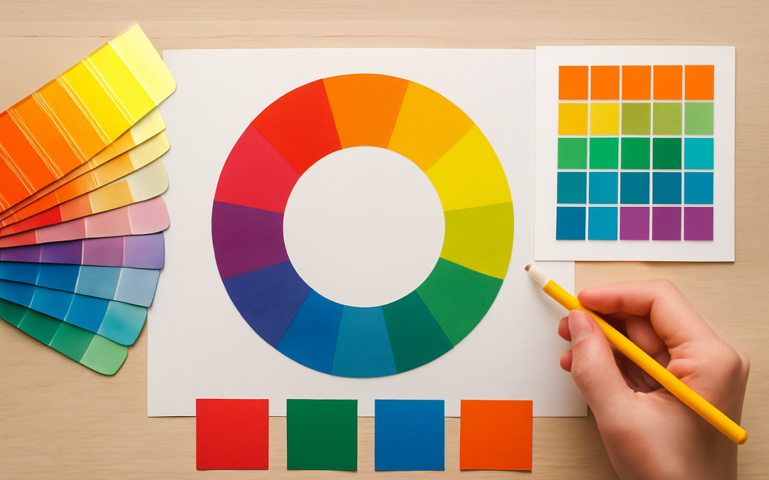
One of the most famous tools in color theory is the color wheel, originally developed by Isaac Newton in the 17th century. The wheel arranges hues in a circular format that visually represents their relationships. Primary colors—red, blue, and yellow—are positioned equidistantly around the wheel. From these, secondary colors such as orange, green, and purple emerge by mixing two primaries. Tertiary colors fill the spaces between primaries and secondaries, showing intermediate shades. This layout makes it easier to understand complementary, analogous, and triadic color schemes, which help artists select color combinations that are balanced or intentionally contrasting.
Complementary colors lie opposite each other on the color wheel and create a striking contrast when paired together. For example, red complements green, and blue complements orange. Using complementary colors can produce visual vibrancy and energy; however, if overused, these combinations might become overwhelming or garish. Conversely, analogous colors, which are adjacent on the wheel, offer a more harmonious and cohesive feel by blending similar hues together. Triadic color schemes involve three colors evenly spaced around the wheel, offering a balanced yet dynamic palette that often appears more playful or vibrant.
Beyond aesthetics, color theory also hinges on how humans perceive and interpret color. The human eye contains photoreceptor cells called cones that detect different wavelengths of light corresponding roughly to red, green, and blue. Our brain processes these signals to produce the perception of a full spectrum of colors. This trichromatic system underpins the RGB color model, commonly used in digital displays, while the CMYK model—cyan, magenta, yellow, and black—is employed in print. Understanding these models is crucial for designers working across different media to ensure consistent color reproduction and avoid unintended shifts in hue or tone.
Psychological responses to color vary widely depending on cultural context, personal experience, and even individual biology. Red can symbolize passion, danger, or excitement, while blue often evokes calmness and trustworthiness. Yellow might suggest optimism and energy but can also indicate caution. Designers leverage these associations to influence mood and behavior subtly or explicitly. For example, fast-food chains often use red and yellow to stimulate appetite and speed of service, whereas healthcare brands may favor blue to instill a sense of reliability.
Light plays a critical role in color perception as well. The way colors appear is influenced by the quality and source of light. Natural daylight tends to reveal colors in their purest form, while artificial lighting can alter their appearance significantly. There are also different types of artificial light, such as incandescent, fluorescent, and LED, each with unique spectral profiles that can make colors look warmer, cooler, or differently saturated. Additionally, the context in which a color is viewed, including surrounding colors and textures, affects how it is perceived—an effect known as simultaneous contrast.
The concept of color harmony is central to the practical application of color theory. Harmony refers to a pleasing arrangement of colors that creates balance and a sense of order. While the color wheel helps identify harmonious color schemes, harmony also depends on the proportions and placements of colors. For instance, a design predominantly composed of cool colors like blue and green can be punctuated by a small area of warm color such as orange to draw attention and create focal points. The balance between harmony and contrast allows compositions to be visually engaging without being chaotic.
Color temperature, a term borrowed from physics, describes the warmth or coolness of a color. Warm colors include reds, oranges, and yellows, typically associated with energy and warmth. Cool colors, such as blues, greens, and purples, suggest calmness and serenity. Designers use this dichotomy not only to influence mood but also to create a sense of spatial depth. Warm colors tend to appear closer, while cool colors recede, giving compositions a three-dimensional feel even on flat surfaces. Understanding this principle allows for more sophisticated layering and depth in visual narratives.
Cultural differences add complexity to color theory’s application on a global scale. While some colors have near-universal meanings, such as red’s association with warning or passion, others can differ dramatically. In many Western cultures, white signifies purity and weddings, whereas in some Eastern contexts, white is linked to mourning and funerals. Therefore, color choices in branding, marketing, or art must be carefully considered to resonate appropriately with target audiences. Ignoring these cultural nuances can lead to misinterpretation or unintended offense.
Another often overlooked aspect of color theory is color accessibility. Designers must consider how their color choices affect people with color vision deficiencies, the most common being red-green color blindness. To create inclusive designs, contrast between colors should be sufficient not only for aesthetic purposes but also for legibility and functionality. This requires testing palettes with accessibility tools and sometimes relying on texture or pattern cues in addition to color differentiation. Accessibility ensures that visual information is clear and usable by the widest possible audience.
Modern technology has expanded the possibilities and challenges of color theory. Computer monitors, smartphones, and tablets each render color differently due to variations in screen quality, calibration, and technology. Digital artists and designers must often work within color spaces such as sRGB, Adobe RGB, or ProPhoto RGB, which define ranges of colors that devices can display. Choosing the appropriate color space for a given project is essential to preserving color fidelity from creation through to viewing on different devices or in print.
Color theory also intersects with emerging fields like neuroscience and marketing science, revealing how color impacts human cognition and decision-making. Studies show that certain colors can influence purchasing behavior, improve memory retention, or convey brand personality more effectively. Marketers might use red to create urgency for limited-time offers or blue to communicate trustworthiness in financial services. These insights are backed by empirical data, underscoring that color choices are not merely artistic but strategic decisions grounded in how humans respond to visual stimuli.
In artistic practice, mastering color theory unlocks a vast range of expressive possibilities. Artists manipulate color schemes to evoke atmosphere, suggest movement, or heighten emotional impact. Impressionists, for example, experimented with juxtaposing complementary colors to produce vibrant effects that were more faithful to natural light than traditional blending. Contemporary artists employ digital tools that rely heavily on color theory principles to fine-tune color interactions and create unique visual experiences. The dialogue between tradition and innovation continues to shape evolving understandings of how color works.
Ultimately, color theory is an evolving discipline rooted in centuries of scientific study and artistic experimentation. While the fundamentals remain consistent, new discoveries about human perception, advances in digital technology, and shifting cultural meanings continually reshape how color theory is applied. Its true power lies in guiding creators toward thoughtful, deliberate color choices that resonate on emotional and functional levels. With a solid grasp of color theory, anyone can harness color’s potential to inform, delight, and inspire in myriad ways.
The interplay of color’s physical properties, psychological effects, and cultural significances makes it one of the most fascinating elements of visual art and design. By moving beyond surface-level assumptions and engaging deeply with color theory, creators unlock a language rich with nuance and meaning. This language, when used skillfully, transcends barriers and communicates instantly across diverse audiences. Mastery of color theory is not just about knowing which colors look good together but understanding how and why colors influence the way we see and feel the world around us.