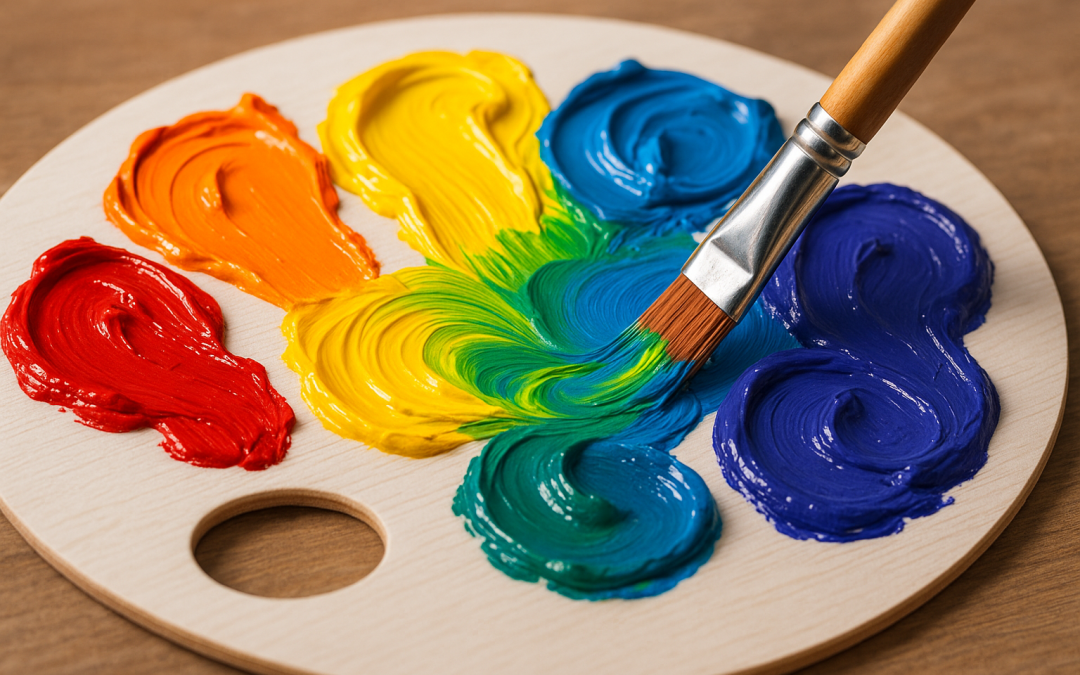
Achieving vibrant, clean colors when mixing paints or pigments is a challenge artists often face, particularly because the risk of muddy tones can easily compromise the visual clarity and dynamic range of a composition. When colors combine in an uncontrolled or careless manner, the result can become dull, lifeless, and uninspiring—a clear departure from the bright and harmonious hues an artist hopes to achieve. Understanding the fundamentals of color mixing and employing strategic techniques ensures that hues maintain their intensity and purity, transforming a painting from ordinary to extraordinary without the dreaded muddiness that detracts from artistic expression.
One of the foundational concepts to grasp when mixing color without mud involves an understanding of color theory, specifically the relationships between hues on the color wheel. Complementary colors—those opposite each other on the wheel, such as red and green or blue and orange—when mixed directly often produce muted or grayish tones. This occurs because complementary colors contain traces of all three primary colors, so when combined, they tend to neutralize each other. Artists aiming to maintain the brilliance of their mixtures will avoid blending direct complements in equal amounts, instead opting for more nuanced combinations or utilizing intermediate hues to preserve the vibrancy of each color.
Another key factor to consider is the use of transparent versus opaque paints. Transparent colors allow light to pass through layers and interact with the colors underneath, creating options for glazing techniques that enhance luminosity and color depth. Opaque paints, on the other hand, can quickly lead to a muddied appearance when mixed excessively, as they cover underlying layers and accumulate pigments that neutralize color intensity. Painters looking to avoid dull results should explore the advantages of glazing, layering thin transparent washes over each other to yield radiant colors unaffected by direct physical mixture. This approach leverages the physical properties of pigments, rather than relying solely on conventional wet-on-wet mixing.
The choice of primary colors also greatly influences the potential for mud when mixing. Not all primaries are created equally; for example, a warm red mixed with a cool blue will behave differently from a cool red mixed with a warm blue. Selecting primaries with pure spectral qualities—meaning less bias toward other colors—helps maintain clarity. A typical artist’s palette might include a warm red like cadmium scarlet, a cool blue like ultramarine, and a warm yellow like cadmium yellow medium. By understanding the inherent warmth or coolness in these colors, mixing can be more controlled, avoiding combinations that unintentionally cancel each other out and create dull results.
Proper paint consistency and medium use are other essential components in avoiding muddiness. Paint that is too wet or overly diluted may cause pigments to blend in an uncontrolled way, undermining the artist’s ability to create defined, clean colors. Conversely, paint that is too thick or dry makes it difficult to blend smoothly, often leading to uneven textures or streaks that can also affect the perception of color vibrancy. Using mediums designed for specific paint types, such as acrylic retarders or oil painting mediums, enables greater control over drying times, blending capabilities, and transparency, all of which contribute to crisp color mixing.
A practical technique to maintain clean color mixtures is the methodical cleaning of brushes between color applications. Brushes that carry residual pigments from one color to another can introduce unintended colors into the mix, leading to unpredictable results that often look muddy. Rinsing brushes thoroughly and drying them before loading new pigments is a simple but effective habit. Additionally, maintaining a well-organized palette, where colors are separated intentionally and mixed in small, precise quantities, helps prevent accidental contamination of colors that can compromise purity.
In the realm of color mixing, the order and timing of combining colors also play a vital role in avoiding mud. Wet-on-wet painting, although admired for its spontaneity and fluidity, requires skillful control to prevent excessive blending that can neutralize colors. An artist might instead work wet-on-dry, allowing each layer to dry completely before applying the next. This technique preserves the integrity of each individual hue and allows for layering effects that build richness without losing clarity. Patience in the painting process often pays off with color combinations that appear luminous rather than muddy.
Understanding the influence of the individual pigments’ properties expands the artist’s toolkit for clean color mixing. Pigments vary in tinting strength, granulation, opacity, and lightfastness. For instance, pigments with strong tinting strength can overwhelm more delicate colors, creating unbalanced mixes. Granulating pigments introduce texture and visual interest but may affect how colors visually blend on the canvas. Selecting pigments with desirable characteristics for careful mixing enables artists to predict outcomes better and create harmonious color blends that retain intensity. Knowledge of pigment chemistry, although often overlooked, is an asset in producing clean, dynamic color mixes.
Another frequently overlooked factor in preventing muddy colors is the influence of the neutral gray or earth tones on the palette and canvas. While earth tones—such as raw umber, burnt sienna, and ochre—offer subtle, natural shades that are valuable in many contexts, they can easily dull vibrant colors if overused or mixed indiscriminately. Strategic use of earth tones as modifiers, rather than validators of many mixtures, preserves brightness. Additionally, choosing cool or warm grays instead of neutral mid-tone gray can influence the temperature of the mixed colors, either enhancing or diminishing their brilliance. Masterful painters know to use grays and earth tones judiciously, enhancing rather than detracting from overall color vitality.
In addition to understanding the technical aspects of pigment mixing, an artist’s eye plays a decisive role in avoiding mud. Training oneself to distinguish between vibrantly mixed colors and those heading toward dullness develops over time through observation and practice. This experiential learning empowers painters to adjust mixing proportions, color temperature, and painting techniques dynamically as the work progresses. Artistic intuition is not a substitute for knowledge but a complementary tool that guides the hand while keeping the palette lively and fresh.
Experimentation provides valuable experience in color mixing without ending up with mud. Trying different pigment combinations on a test surface prior to introducing them to a final piece allows an artist to assess the effects in a controlled environment. Testing the interaction of colors in various proportions and under different blending techniques yields insights that inform more successful results when applied to the actual artwork. Over time, creating a personal color mixing chart or guide tailored to the specific set of pigments chosen can be an invaluable resource, reducing guesswork and enhancing creative confidence.
The support surface and ground applied to a canvas or paper also impact how colors behave and appear when mixed. A tinted ground slightly altering the undertones can shift the way colors interact, sometimes enhancing or muting their perceived intensity. For example, a warm-toned ground can bring out the brightness in cool blues or greens, while a cool-toned ground might have the opposite effect. Understanding the interaction between pigment and support allows for better preparation and strategic layering, ensuring color mixtures remain crisp and visually appealing rather than becoming muddied or lifeless.
Lighting conditions further influence the perception of color mixtures. Natural daylight, with its balanced spectrum, generally allows artists to see colors most accurately, whereas artificial lighting with dominant warm or cool tones can alter how color blends appear. Painting in consistent, high-quality light ensures that an artist judges their color mixtures correctly in real time, preventing unwanted surprises of perceived muddiness once a piece is viewed under different lighting. Adjusting for lighting is especially important during critical stages of color mixing and final evaluations.
Many artists underestimate the role that psychological perception plays in color mixing. The surrounding colors in an artwork can affect how a particular color is perceived. Simultaneous contrast, where adjacent colors enhance or dull one another, means that a color mix that looks perfect in isolation may appear muddied when placed next to certain hues. Conscious arrangement of colors in compositions, with attention to warm and cool contrasts and value relationships, helps prevent the impression of muddiness even when colors are physically mixed. Strategic placement and value control reinforce an impression of clarity and brilliance.
While the traditional subtractive color mixing model explains how pigments combine to absorb and reflect light, artists can also make use of additive color effects through layering and glazing. Thin translucent layers allow light to pass through various pigments, effectively mixing colors optically rather than physically. This method frequently results in cleaner and brighter appearances because the pigments do not physically blend on the palette or canvas surface to form dull browns or grays. Optical mixing exploits human vision physiology—where the eye blends color mixtures over small distances—resulting in vibrant images with depth and luminosity.
In modern art processes, digital tools also provide insight into avoiding muddy color mixes. Digital color mixing simulates pigment interactions and can serve as a visual testing ground for potential mixes before applying paint. While digital media differ from physical media in behavior, the principles of color harmony and contrast remain consistent. For physical painters, using digital tools as a reference or aid enhances understanding of color relationships, allowing artists to plan mixtures carefully and avoid errant results on canvas. This integration of traditional and contemporary techniques can raise the quality and clarity of mixed colors.
It is worth mentioning that no single approach guarantees avoidance of muddy color mixtures in every situation. Artistic styles, media, and intentions vary widely, and sometimes muted or earthy tones are deliberate choices to convey mood and atmosphere. The challenge lies in recognizing when colors are unintentionally muddied and adjusting technique accordingly. Discipline in color mixing, intentional use of complementary colors, understanding pigment properties, controlled layering, and thoughtful observation constitute a collective set of practices that empower artists to create vivid, pure mixtures that bring works to life.
In conclusion, mastering the art of mixing color without mud requires both technical knowledge and practiced skill. By understanding color relationships, employing transparent layers, choosing suitable primaries, and maintaining clean working habits, artists protect the vibrancy and integrity of their palettes. Thoughtful attention to pigment properties, surface preparation, lighting, and perceptual effects further enhances the visual clarity of mixed colors. Through experimentation and experience, artists develop an intuitive grasp of color mixing, allowing their creations to glow with brightness and harmony rather than being dulled by unwanted muddiness. Ultimately, conscious and deliberate mixing transforms raw pigments into a language of light and emotion that captivates the viewer.