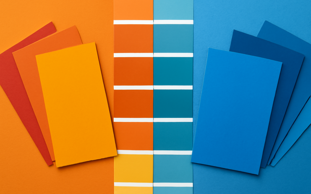
Colors have a profound impact on our emotions, perceptions, and behaviors. They can evoke certain moods, influence decisions, and shape the atmosphere of a space or design. Understanding the psychological effects of colors—especially the distinction between warm and cool hues—can offer valuable insight into how we interact with our environments and the messages that colors communicate nonverbally. Warm and cool colors each carry unique psychological traits, and their use can dramatically alter the feeling of a space, product, or image.
Warm colors, including reds, oranges, and yellows, are often associated with energy, excitement, and a sense of warmth or comfort. These colors tend to stimulate the mind and body, evoking feelings of passion, enthusiasm, and vitality. Red, for example, is frequently linked with intensity and urgency, often used to grab attention or symbolize love and danger simultaneously. Orange blends the energy of red with the cheerfulness of yellow, resulting in a vibrant and inviting hue that suggests creativity and adventure. Yellow, bright and luminous, is typically connected with happiness, optimism, and friendliness. Because of these vibrant and energetic qualities, warm colors can stimulate activity and social interaction, making them ideal for environments such as restaurants, gyms, and family gathering spaces.
In contrast, cool colors like blue, green, and purple evoke a sense of calmness, relaxation, and tranquility. These colors tend to slow the heart rate and calm the mind, often associated with stability, peace, and restfulness. Blue, in particular, is one of the most universally accepted cool colors, symbolizing trust, loyalty, and serenity. This makes it a popular choice in corporate branding and healthcare environments where a sense of reliability and calm is crucial. Green carries meanings of growth, renewal, and balance, strongly tied to nature and health. Purple, a combination of blue’s calmness and red’s energy, balances creativity with introspection, often linked with luxury, wisdom, and spirituality. When cool colors dominate an environment, they can help reduce stress and encourage thoughtful reflection, making them well-suited for bedrooms, offices, and places designed for meditation or healing.
The psychological impacts of warm and cool colors extend beyond simply evoking moods; they also influence how space and size are perceived. Warm colors have the tendency to make spaces feel cozier and appear smaller because they seem to advance toward the viewer. This effect can be desirable in large, open areas that need a more intimate atmosphere. For example, a living room painted in a rich warm hue can feel welcoming and cozy, drawing people together. On the other hand, cool colors tend to recede visually, which can make spaces appear larger and more open. A bedroom or office painted in soft blues or greens can feel airy and spacious, promoting calmness and focus. This knowledge allows designers, architects, and homeowners to strategically use warm and cool colors to manipulate spatial perception and create the desired psychological environment.
In addition to physical spaces, warm and cool color psychology plays a critical role in marketing and branding. Companies exploit the emotional triggers associated with colors to align their brands with specific consumer perceptions and behaviors. Warm colors are often used to provoke action, stimulate appetite, or convey friendliness and approachability. Fast food chains frequently utilize reds and oranges to create a sense of urgency and hunger, nudging customers toward quicker decision-making. Conversely, cool colors are employed to communicate professionalism, reliability, and tranquility. Financial institutions or technology companies often choose blues and greens in their logos and advertisements to foster a sense of trustworthiness and calm assurance. The effective use of warm and cool colors in advertising can subtly influence purchasing behavior and customer loyalty by activating particular emotional responses.
The interplay between warm and cool colors also plays a significant role in artistic expression and storytelling. Artists use these colors to generate emotional depth and narrative tension within their work. Warm colors can create focal points, highlight action, or convey intensity and passion. They can express emotions ranging from joy and warmth to anger and aggression, depending on context and intensity. Cool colors, meanwhile, offer relief, create background atmospheres, or symbolize introspective states such as sadness, contemplation, or peace. In paintings, photography, and film, the balance between warm and cool tones can guide the viewer’s emotional journey, creating harmony or juxtaposition that deepens the storytelling experience. The manipulation of these colors strengthens the audience’s connection to the subject matter by resonating on a subconscious emotional level.
Despite these general psychological tendencies, it’s important to recognize that personal experiences, cultural backgrounds, and individual differences shape how any given person perceives warm and cool colors. For example, while red is often seen as exciting or aggressive in Western cultures, it carries auspicious and celebratory connotations in many Eastern cultures. Similarly, blue represents sadness in some contexts but can also symbolize spirituality or strength elsewhere. These variations remind us that color psychology is not a one-size-fits-all science but rather a complex and nuanced field that intersects with cultural symbolism and personal memories. Awareness of this diversity is essential when applying warm and cool colors in multicultural contexts or in settings where cultural sensitivity is paramount.
Furthermore, the saturation and brightness of warm and cool colors also affect their psychological impact. Highly saturated warm colors tend to be more stimulating and aggressive, while muted or pastel warm tones can feel comforting and cozy. In the same way, bright and intense cool colors may sometimes feel cold or detached, whereas softer, subdued cool tones can instill calmness and serenity. This range within both categories allows for intricate emotional expression and fine-tuning of atmospheres. Designers, artists, and communicators can use this variability to target very specific emotional responses, blending warmth or coolness with intensity and subtlety to achieve their goals.
The psychological effects of color can also have biological underpinnings. Research indicates that warm colors such as red and orange can increase heart rate and trigger physiological arousal, which might explain why these hues are invigorating and attention-grabbing. Cool colors often elicit decreases in heart rate and blood pressure, supporting their association with relaxation and calm. This biological response further reinforces how deeply color influences human psychology, extending not only to mental and emotional states but to physical conditions as well. By integrating an understanding of these biological effects, professionals in healthcare, education, and workspace design can create environments that support well-being and improve outcomes.
Within environments of work and learning, the choice between warm and cool colors holds considerable significance. Warm colors, by boosting energy and enthusiasm, can be advantageous in active workspaces where creativity and collaboration are prioritized. They stimulate social interaction and can reduce feelings of lethargy or boredom. However, in areas requiring focused attention, calm, and mental clarity, cool colors offer distinct benefits. Blue and green hues are often recommended for libraries, study areas, and offices where concentration and mental stamina are critical, as they reduce distractions and help maintain calm focus. In this way, understanding the psychological effect of warm versus cool colors enables the strategic design of spaces that optimize productivity and well-being based on the nature of the activity.
In the realm of interior design, balancing warm and cool colors can create lively, harmonious spaces. While a single color scheme may lean predominantly warm or cool, mixing elements from both palettes often enhances visual interest and emotional complexity. For example, pairing warm, earthy tones of terracotta or ochre with cool shades of teal or navy can provide a dynamic balance between energy and tranquility. This approach helps prevent monotony or overstimulation, striking a middle ground that caters to a wider range of emotional needs. It can also foster a sophisticated and inviting aesthetic that appeals to diverse preferences. Thoughtful coordination of warm and cool colors thus plays a critical role in crafting environments that feel both engaging and comforting.
Fashion and personal style are another domain where the psychology of warm and cool colors is evident. Clothing colors influence how individuals are perceived and how they experience their environments. Warm colors in apparel tend to convey confidence, approachability, and boldness, often drawing attention or signaling warmth in social interactions. Cool-colored clothing can project professionalism, calm, and subtlety, contributing to perceptions of composure and thoughtfulness. Moreover, people may choose warm or cool color wardrobes based on their seasonal colorology or personal color compatibility, which further affects their psychological comfort and self-expression. This connection between color psychology and fashion highlights how deeply colored hues are intertwined with identity and interpersonal communication.
Technology and digital interfaces also benefit from a nuanced understanding of warm and cool color psychology. User interface designers frequently leverage these color categories to influence user behavior and experience. Warm colors in calls-to-action or notifications prompt immediate attention, encouraging clicks and engagement. Cool colors dominate backgrounds and navigation elements to reduce eye strain and enhance readability. Additionally, dark mode interfaces often use cool tones to provide a relaxing and less intrusive experience during prolonged use. The thoughtful application of warm and cool colors within digital spaces enhances usability, accessibility, and emotional resonance, reflecting the powerful role color psychology plays even in intangible environments.
It is worth noting that the symbolic meanings associated with warm and cool colors have evolved over time and are continually shaped by contemporary cultural trends and technological advancements. For instance, neon warm colors may now symbolize modernity and digital excitement, differing from traditional associations of warmth and comfort. Similarly, cool colors might be linked with innovation and futurism in certain contexts, diverging from their established calming connotations. This evolving symbolism underscores the dynamic nature of color psychology and its responsiveness to cultural shifts. Staying attuned to these trends allows creatives and marketers to use warm and cool colors in ways that resonate effectively with current audiences.
In therapeutic settings, the deliberate use of warm and cool colors can support mental health and wellness. Color therapy, or chromotherapy, capitalizes on the psychological effects of hues to influence mood and emotional states. Warm colors can help stimulate energy in individuals experiencing depression or lethargy, providing motivation and vitality. Cool colors may be used to soothe anxiety, tension, or emotional overwhelm, fostering relaxation and stability. While scientific evidence varies in support of chromotherapy, the psychological and emotional impact of colors is widely acknowledged in various forms of counseling and environmental therapy. Integrating color psychology in such approaches enhances the therapeutic experience by addressing nonverbal emotional needs.
Ultimately, mastery of the psychological effects of warm and cool colors enriches any field that relies on visual communication and environmental design. Whether creating a brand identity, designing a workspace, formulating a product, or decorating a home, the purposeful deployment of color hues can deeply influence perception and mood. Warm colors invite interaction, enthusiasm, and warmth, while cool colors provide repose, trust, and reflection. The balance or contrast between these hues creates compelling visual narratives that resonate with the human psyche on multiple levels. Understanding and applying the nuanced effects of warm versus cool colors enables more intentional, effective communication that goes beyond words, connecting directly with emotional experience.