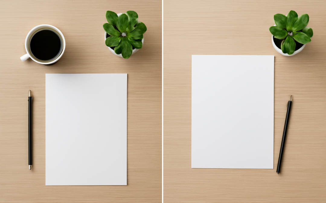
Design plays a pivotal role in how information is consumed, perceived, and remembered. One of the fundamental aspects of design is layout, which dictates the arrangement of elements on a page, screen, or any visual medium. Among the myriad layout styles, two of the most noteworthy and widely used are centered and asymmetrical layouts. These two approaches offer distinct visual experiences and impact the way content resonates with an audience. Understanding their differences, advantages, and applications can enhance the effectiveness of any design project.
Centered layouts have long been associated with balance, clarity, and simplicity. When elements are symmetrically organized around a central axis, they foster a sense of stability and order that is comfortable for viewers. This style evokes a feeling of formality and classical beauty, often seen in traditional print media, websites, and user interfaces. Centered designs tend to guide the viewer’s eye naturally to the focal point, which usually resides in the middle of the composition. This direct visual path makes centered layouts especially effective for highlighting key messages or calls to action without distractions.
The appeal of a centered layout lies not only in its neat and organized appearance but also in its universal accessibility. Because it mirrors the natural tendency for the eye to seek balance, this approach creates a psychologically soothing experience. In web design, for instance, centered content can be particularly useful on smaller screens or devices where horizontal space is limited, as it ensures that the content remains the focus without requiring constant horizontal adjustment. Additionally, centered layouts often make responsive design smoother, allowing for harmonious visual consistency across different platforms.
On the flip side, asymmetrical layouts embrace a more dynamic, modern, and sometimes chaotic aesthetic. Unlike centered layouts that seek balance by mirroring elements, asymmetrical designs rely on the strategic placement of components of unequal visual weight to generate interest and movement. This approach challenges traditional norms and draws attention not through order, but through thoughtful imbalance. The deliberate contrast between elements can encourage viewers to explore different parts of the design, creating a more engaging and interactive experience.
One of the key strengths of asymmetrical layouts is their ability to convey personality and uniqueness. Because they break away from symmetry, they often resonate well with brands or projects aiming to appear innovative, edgy, or unconventional. This visual unpredictability can stimulate curiosity and make a design more memorable. When executed skillfully, an asymmetrical layout can serve as a powerful tool for storytelling, using spatial relationships and visual tension to guide the viewer’s journey through the content in a nuanced way.
Choosing between centered and asymmetrical layouts largely depends on the goals of the design and the nature of the content. Centered layouts tend to excel in situations where clarity, simplicity, and timeless elegance are paramount. For example, portfolios, landing pages promoting a single product, or presentations meant to deliver concise information benefit from the focus a centered layout provides. The structured nature of the layout minimizes distractions, which can help convert visitors into customers or drive home a particular message effectively.
Conversely, asymmetrical layouts are often the preferred choice for editorial designs, advertising campaigns, and artistic projects where creativity and experimentation take center stage. Magazines, fashion websites, and creative agencies frequently use asymmetry to create visual excitement. Because this style offers flexibility, it allows designers to incorporate multiple focal points, varied typography, and diverse imagery in ways that feel organic rather than forced. Such layouts can elevate content by adding layers of meaning and inviting viewers to engage more thoughtfully.
Another consideration in the centered versus asymmetrical debate is how each layout handles hierarchy. Centered designs typically emphasize a strong, linear hierarchy, guiding the viewer through the content in a straightforward manner from top to bottom or from the center outwards. This can simplify the user experience, especially for those seeking quick access to key information. Meanwhile, asymmetrical layouts often embrace a more complex hierarchy, relying on scale, color contrast, and positioning to lead the eye unpredictably across the page. While this can enhance interest and depth, it demands careful planning to avoid confusion or overwhelming the viewer.
The emotional response elicited by centered and asymmetrical layouts also differs significantly. Centered designs often evoke feelings of calmness, trust, and familiarity due to their harmonious and balanced nature. They are reassuring, offering a clear order in a world that can sometimes feel chaotic. On the other hand, asymmetrical layouts tend to stimulate excitement, intrigue, and even tension. Their lack of symmetry challenges expectations and invites closer inspection, which can be particularly effective in grabbing attention in competitive visual environments.
In terms of usability, both layouts offer unique benefits and challenges. Centered layouts, with their predictable structure, often translate into straightforward navigation and readability. This predictability can reduce cognitive load, helping users process information efficiently. However, the very predictability of centered layouts can sometimes render them less memorable or dull, especially in contexts where innovation is prized. Asymmetrical layouts, while more engaging, risk confusing users if not carefully designed. The challenge lies in balancing creativity with functionality to ensure viewers are not lost or deterred by chaos.
Technological advancements and changes in viewing habits have influenced the popularity and effectiveness of both layout styles. The rise of mobile devices with varied screen sizes has reinforced the relevance of centered layouts for certain applications, given their adaptability to different resolutions without losing visual integrity. Conversely, high-resolution screens and sophisticated design software have empowered designers to experiment boldly with asymmetry, layering, and complex grids without sacrificing clarity.
The choice between a centered and asymmetrical layout is also deeply intertwined with cultural and contextual factors. For example, in certain cultures and industries, symmetry and classic composition might be associated with professionalism, authority, and trustworthiness, making centered layouts the natural choice. In more avant-garde or youth-oriented markets, asymmetry might better reflect the values of diversity, fluidity, and rebellion. A designer’s sensitivity to these nuances can greatly influence the ultimate success of a design.
From a psychological perspective, the human brain’s response to visual patterns plays a role in how these layouts are perceived. Symmetrical patterns are often processed more quickly, leading to a sense of ease and comfort. This can be valuable in environments where quick comprehension is necessary, such as public signage or instructional materials. Asymmetry, conversely, requires more cognitive engagement, which can prolong attention and deepen understanding, particularly in contexts where storytelling or brand differentiation is important.
Brand identity is another crucial factor in deciding between centered and asymmetrical layouts. A brand that aims for a clean, dependable, and classic image might gravitate towards centered layouts due to their timeless appeal. In contrast, brands emphasizing innovation, dynamism, and creativity may align better with the unpredictable nature of asymmetry. The layout becomes a silent ambassador of brand values, reinforcing messaging beyond words and imagery.
Moreover, the integration of typography, imagery, and color with either centered or asymmetrical layouts can distinctly affect overall design effectiveness. Centered layouts often benefit from straightforward typographic hierarchies and balanced imagery, making the message clear and impactful. Asymmetrical designs, however, allow for bold typographic choices and layered visuals, providing opportunities for nuanced visual storytelling that can resonate emotionally with audiences.
While there is inherent value in understanding the strengths of centered and asymmetrical layouts independently, modern design often finds inspiration in blending the two. Hybrid approaches combine the stability of centered elements with the energetic flow of asymmetrical features, creating compositions that feel both grounded and dynamic. This mixing requires a deft hand and thoughtful planning but can result in eye-catching and memorable designs that leverage the best of both worlds.
The choice of layout also influences practical aspects such as development time and ease of updates. Centered layouts, due to their simplicity and predictability, might be quicker to implement and maintain, especially with standardized components. Asymmetrical layouts often pose more complexity, necessitating bespoke solutions and more frequent refinements to maintain visual balance as content changes. This consideration is especially relevant in digital projects with evolving content.
User testing and feedback play a crucial role in determining the most appropriate layout approach. What works well aesthetically might not always translate into effective communication or user engagement. Testing can reveal how different audiences respond to centered versus asymmetrical designs, uncovering preferences, readability issues, or engagement patterns. Such insights can inform iterative improvements, helping designers craft layouts that are not only visually pleasing but also functional.
In educational and instructional design, the choice of layout profoundly impacts learning outcomes. Centered layouts, by providing predictable paths and clear focus, can facilitate comprehension and retention for straightforward material. Conversely, asymmetrical layouts can be harnessed to highlight connections, emphasize relationships, or create emotional resonance, adding depth to complex or creative topics. Intentional choice aligned with pedagogical goals ensures the layout supports learning rather than distracts from it.
Accessibility considerations cannot be overlooked when comparing layout styles. Centered layouts often provide easier reading experiences for individuals with cognitive or visual impairments due to their uniformity and straightforward flow. Asymmetrical layouts must be carefully designed to maintain contrast, clarity, and logical navigation to avoid alienating any users. Inclusive design principles dictate that regardless of style, the final layout should be usable and welcoming to diverse audiences.
From a historical perspective, the evolution of centered and asymmetrical layouts reflects broader shifts in artistic and cultural paradigms. The classical and Renaissance periods favored symmetry and centered compositions, mirroring ideals of balance and harmony in nature and society. The 20th and 21st centuries, with movements such as modernism, postmodernism, and digital culture, embraced asymmetry as a means to express complexity, fragmentation, and plurality. These shifts illustrate how design is a mirror of human thought and social context.
Practical applications of centered and asymmetrical layouts span numerous fields beyond traditional media. In architecture, centered layouts correspond to symmetrical building facades, while asymmetry introduces innovative spatial configurations. In fashion, balanced patterns evoke classic styles, whereas asymmetrical cuts suggest avant-garde sensibilities. Even in product packaging, the layout can convey the intended brand identity and attract different consumer segments through these design choices.
In conclusion, the choice between centered and asymmetrical layouts hinges on the intended message, audience, context, and functional needs. Both approaches offer unique visual languages that can either deliver clarity and order or stimulate curiosity and engagement. Skilled designers recognize the power of layout as more than mere aesthetics; it is a foundational element that shapes perception, guides understanding, and embodies the spirit of the content. By thoughtfully selecting and executing the appropriate layout style, designers ensure their work resonates authentically and powerfully with those who experience it.