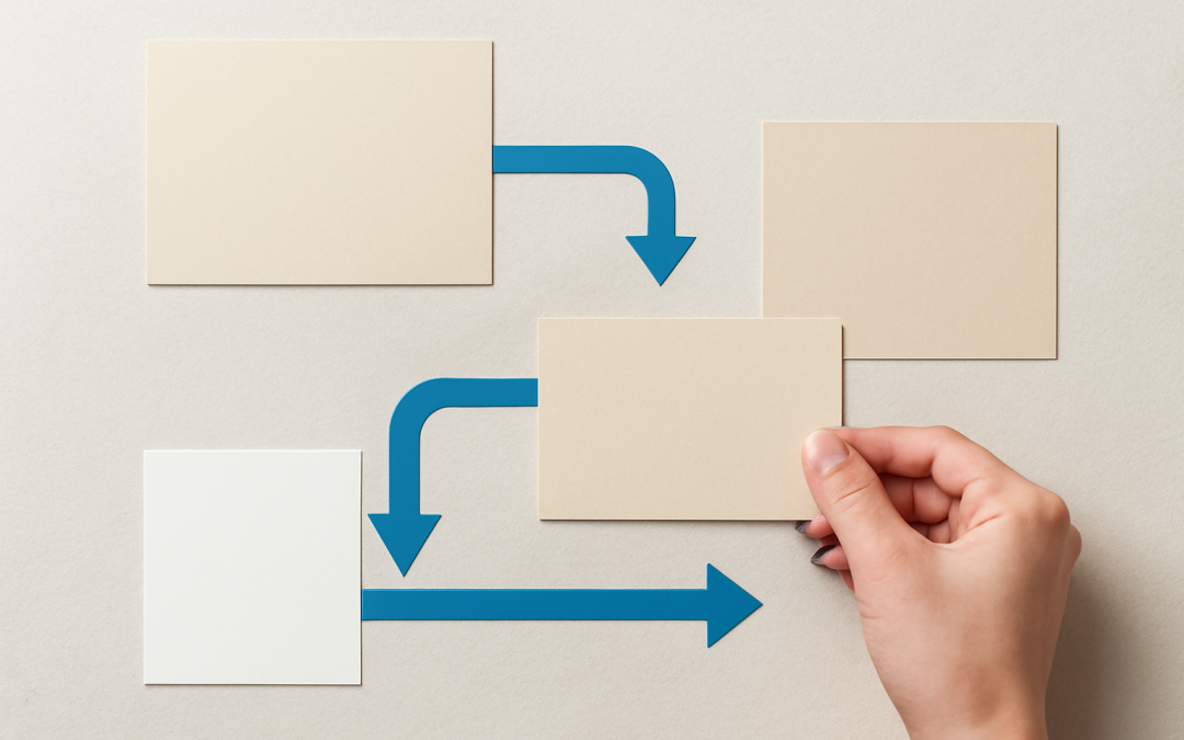
Creating an effective layout is more than just arranging elements on a page; it involves guiding the viewer’s eye through the design in a deliberate and meaningful way. Achieving a sense of harmony and coherence requires an understanding of how the human eye naturally moves across visual content. Visual flow in layout is the principle that directs this movement, leading viewers seamlessly from one part of the design to another, ensuring that key messages are noticed and understood with ease.
At the heart of visual flow is the strategic placement of elements such as images, text blocks, whitespace, and color. Human vision generally follows certain predictable paths, often starting at the top left of a composition and moving in an F-shaped or Z-shaped pattern, especially in cultures that read left to right. By leveraging these natural tendencies, designers can arrange components to establish a fluid narrative that enhances comprehension and engagement. Without a thoughtful visual flow, even the most compelling content risks being overlooked or misinterpreted.
The concept of visual hierarchy plays a crucial role in establishing flow. Size, contrast, and positioning dictate which elements capture attention first and which follow. Larger elements naturally attract the eye before smaller ones, while contrast in color or typography can highlight important sections. Designers use these tools to create focal points that anchor the viewer’s gaze before guiding it onward through secondary and tertiary information. This creates a structured experience where the viewer intuitively understands the intended order of consumption.
Whitespace, often an overlooked asset in layout design, significantly contributes to visual flow. Rather than merely serving as empty space, thoughtfully applied whitespace provides breathing room between elements, preventing visual clutter and emphasizing each component’s importance. It also helps create connections and separations, guiding the eye smoothly along the intended path. Without adequate whitespace, layouts can feel chaotic and overwhelming, breaking the natural flow and frustrating viewers.
Color choices also influence visual flow by establishing mood and focus. Warm, bright colors can draw attention quickly, while cooler, muted tones tend to recede, helping to create depth and layers within a composition. By alternating colors strategically, designers can signal changes in content hierarchy, leading the viewer’s eye through different sections with clarity. Additionally, using consistent color palettes helps maintain harmony across the design, making transitions between elements feel natural rather than jarring.
Typography is another powerful factor in directing visual flow. Font size, weight, and style work together to construct a readable and engaging typographic hierarchy. Headlines draw in the viewer first through boldness or larger size, followed by subheadings and body text that are progressively easier to scan. Proper line spacing and alignment also foster readability and rhythm, contributing to an organic movement across textual content. Conversely, poorly chosen fonts or chaotic typographic structures can disrupt flow and cause confusion.
Imagery, including photos, illustrations, and icons, can act as visual anchors that either enhance or interrupt the flow depending on their placement and relevance. A well-chosen image aligned with the content’s message invites viewers to pause and absorb the information before moving forward. Directional cues within images, such as subjects looking or pointing in a particular direction, can subconsciously steer the eye to following elements. Designers must carefully balance imagery with text to avoid clutter and ensure harmonious pacing.
Grid systems serve as foundational frameworks for establishing visual flow. By dividing a layout into consistent columns and rows, grids provide structure and alignment that promote orderliness and predictability. This underlying organization allows elements to be placed systematically, creating rhythm and continuity. While grids offer stability, there is still room for creative variation; breaking the grid in strategic ways can introduce dynamism without sacrificing flow, capturing interest while maintaining coherence.
Interactive elements in digital layouts also require consideration for visual flow. User interfaces should guide attention fluidly from calls to action to secondary options without causing friction. Responsive designs adapt to different screen sizes, ensuring flow remains intact regardless of device. Gestures, animations, and transitions can enhance flow by visually connecting changes in state, easing cognitive load and fostering intuitive navigation. Poorly designed interactivity risks breaking flow and detracting from overall usability.
Cultural factors influence how visual flow is perceived and interpreted. The direction of text reading, familiar iconography, and color symbolism vary widely, meaning that layouts successful in one context may not translate seamlessly in another. Designers targeting global audiences must account for these differences to create inclusive layouts that feel natural and intuitive across diverse user groups. Adapting flow to respect these cultural nuances ensures effective communication without alienating or confusing viewers.
Emotional impact is a subtle but important aspect of visual flow. By carefully orchestrating the sequence and style of elements, layouts can evoke feelings ranging from excitement and urgency to calmness and trust. Smooth, gentle transitions and harmonious compositions often foster comfort and ease, while abrupt or cluttered arrangements may generate tension or anxiety. Aligning the emotional tone of a layout with its intended message deepens engagement and helps anchor the viewer’s attention along the prescribed path.
Testing and iteration are essential in refining visual flow. Designers commonly use eye-tracking studies, heatmaps, and user feedback to identify how effectively a layout guides attention. Understanding where viewers pause, skip, or become distracted informs adjustments that enhance clarity and direction. Even small changes in spacing, alignment, or color contrast can significantly improve flow and overall user satisfaction. Continuous refinement ensures layouts remain responsive to evolving user behaviors and expectations.
Simplicity is often the most effective strategy for achieving strong visual flow. Complicated or overly dense designs can overwhelm and confuse, causing the eye to jump erratically or disengage altogether. Prioritizing essential information and eliminating unnecessary elements sharpens focus and clarifies the intended narrative. Minimalist approaches, when paired with precise control over visual hierarchy and movement, frequently result in layouts that feel intuitive and easy to navigate.
Different media formats demand unique considerations for visual flow. Printed materials, digital screens, and mobile devices present varying constraints and opportunities. Print often allows for more intricate and static arrangements, while digital provides interactivity and motion to guide flow dynamically. Mobile interfaces require compact, simplified layouts that accommodate smaller screens without sacrificing clarity. Successful designs adapt their approach to flow depending on these contextual needs, enhancing user experience across platforms.
The role of storytelling is amplified through deliberate visual flow. By structuring layouts that unfold information sequentially, designers enable narratives that resonate more deeply with audiences. Effective flow introduces key concepts early, elaborates with supporting details, and concludes with calls to action or reflective elements, mirroring the natural progression of comprehension. When a viewer can effortlessly follow the story through visual cues, the message sticks more powerfully and is more likely to inspire response.
Incorporating asymmetry and movement can invigorate visual flow, adding interest and energy. While symmetrical designs provide balance and predictability, asymmetric layouts break monotony and encourage the eye to explore. Elements placed off-center or staggered can create pathways that lead attention intentionally, though these must be used with care to avoid disorientation. Movement, whether implied through diagonal lines or literal via animation, can further enhance flow by suggesting direction and encouraging progression.
Color contrast plays a dual role in establishing visual flow by simultaneously highlighting important areas and improving legibility. High contrast between text and background ensures that information is quickly readable, while contrasting colors between different sections can delineate distinct zones in a layout. However, overuse of contrast or clashing colors may distract and fragment the flow. The key is balancing emphasis with harmony to maintain a cohesive journey through the design.
Alignment extends beyond mere neatness to touch on psychological comfort and trustworthiness. Aligning elements along axes creates rhythm and predictability, reassuring viewers and enhancing comprehension. Misaligned components, while sometimes used deliberately for effect, can disrupt flow by introducing visual tension. Consistent alignment also supports scanning and reading efficiency, reducing viewer strain and promoting longer engagement with content.
The influence of typography styles should not be underestimated in shaping mood and flow. Serif fonts often evoke tradition and formality, guiding readers through text with a sense of rhythm, while sans-serif types feel modern and clean, supporting quick scanning. Script or decorative fonts are better reserved for accents or headlines due to legibility challenges. Smart pairing of fonts aids in alternating pace and focus, fostering a comfortable reading experience that smoothly channels attention.
In disciplines like advertising and editorial design, mastering visual flow is crucial for converting casual viewers into engaged consumers. A well-crafted layout captures attention within seconds, directs the eye through benefits and features, and concludes with persuasive calls to action. Interruptions or dead ends in flow can lose potential customers or confuse messages. Therefore, a sophisticated understanding of how to orchestrate visual movement translates directly into business success.
Ultimately, the mastery of visual flow in layout is a blend of art and science, balancing creative intuition with empirical understanding of human perception. Designers must continuously adapt to new technologies, cultural shifts, and audience behaviors to craft layouts that remain engaging and effective. When done skillfully, visual flow transforms static pages into dynamic experiences that speak clearly and compellingly to their audiences, elevating design from mere decoration to powerful communication.