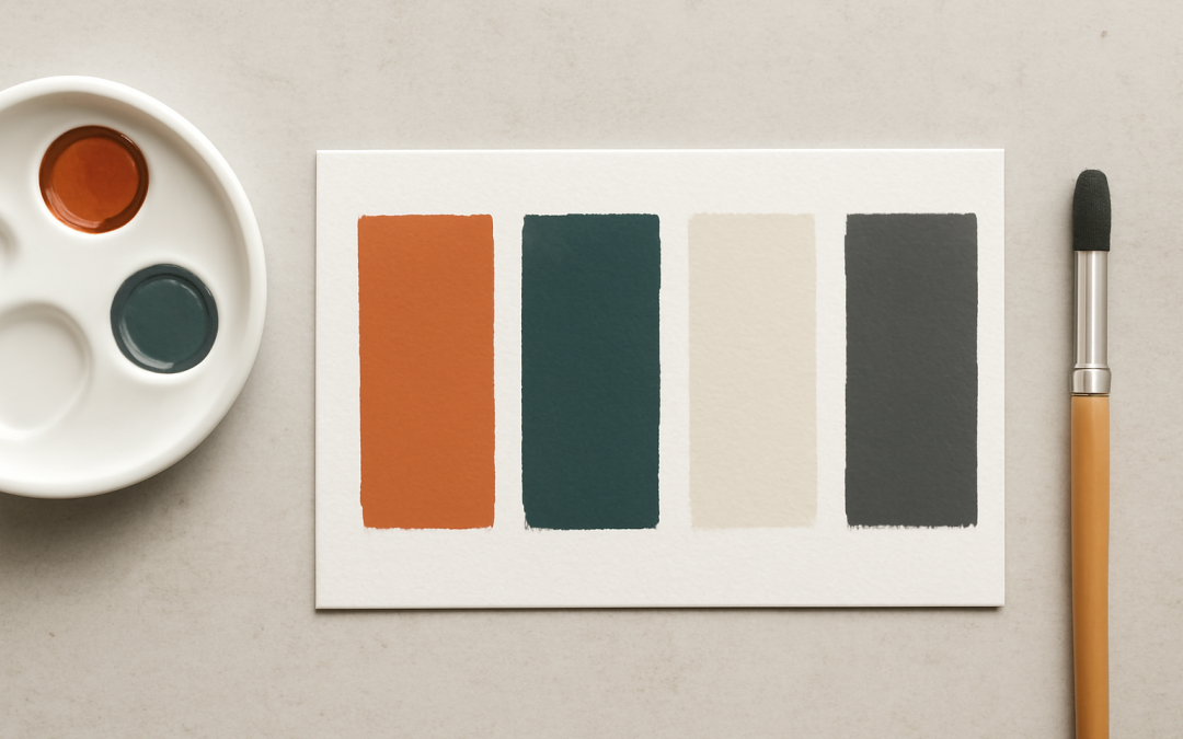
Color plays a fundamental role in the way we perceive and interact with the world around us. From the vast spectrum of hues available, artists, designers, and creators often choose to work with limited color palettes to achieve a specific aesthetic, streamline their creative process, or evoke particular emotions. Using a constrained set of colors not only simplifies decision-making but also offers a unique form of creative discipline that can lead to striking and cohesive results.
A limited color palette refers to the deliberate selection of a small number of colors used throughout a composition, design, or artwork. Rather than incorporating a wide variety of hues and shades, the palette may consist of as few as two or three colors, sometimes extending to five or six, chosen for their harmony and complementarity. This approach forces focus on other elements such as composition, texture, and form while maintaining a strong sense of unity and consistency.
One of the key advantages of working with a limited color palette is the ease of creating visual harmony. When fewer colors are involved, there is a reduced risk of clashing or overwhelming the viewer with too much visual information. This restraint allows for better control over contrast, emphasis, and mood. It also helps in guiding the viewer’s eye to the most important elements of the design or artwork, as color contrasts tend to attract attention.
Limited color palettes are particularly favored in branding and marketing because of their ability to establish a memorable and easily identifiable visual language. Brands often rely on distinctive color schemes to build recognition and convey specific messages or values. By restricting the color options, marketers can create a consistent image across various mediums and platforms, from packaging to web design. This consistency is invaluable for fostering trust and familiarity with the audience.
Artists have historically employed restricted color palettes for both practical and expressive reasons. In eras or regions where access to a broad range of pigments was limited, painters had to rely on the colors that were locally available. This necessity contributed to the development of distinctive regional styles and techniques. In contemporary practice, artists may deliberately limit their palette to challenge themselves or to evoke a particular mood—such as the muted tones of melancholy or the stark contrasts of drama.
Moreover, limited color palettes can significantly enhance the emotional impact of a piece. Colors carry cultural and psychological associations that influence how an artwork or design is perceived. For instance, a palette dominated by cool blues and soft grays might evoke calmness and introspection, while a scheme heavy on reds and oranges can impart energy and urgency. By carefully selecting a narrow range of hues, creators can amplify the intended emotional response and avoid visual distractions.
From a technical perspective, limiting colors also simplifies the production process. In print media, fewer colors can reduce costs and complexities associated with ink usage and color separation. In digital media, optimization is easier when the number of colors is minimized, leading to faster loading times and less data consumption. This practicality makes limited color palettes an effective choice in many professional contexts.
The challenge of using a limited color palette lies in creativity and resourcefulness. When an artist or designer is confined to a minimal set of colors, they must rely more heavily on manipulating value, saturation, and texture to create depth and interest. This constraint encourages innovation in how colors interact and how visual elements are balanced within the composition. Successful use of limited palettes often results in works that are sophisticated in their simplicity.
Understanding color theory is essential when working within these constraints. Knowledge of complementary, analogous, and triadic color schemes helps in selecting colors that will work well together despite their limited quantity. For example, choosing colors from opposite sides of the color wheel can produce striking contrasts that command attention, while selecting colors close in hue creates a more harmonious and subtle effect. Pairing this understanding with limited palettes further enhances the effectiveness of the design.
Another important aspect is considering the cultural context of color choices. Colors do not carry universal meanings, and their interpretations can vary widely across societies and historical periods. Limiting a palette to certain colors can inadvertently communicate messages beyond the conscious intention of the creator. Being mindful of these cultural nuances ensures that the limited palette works as intended and resonates properly with the target audience.
In contemporary digital art and graphic design, limited color palettes are sometimes used to evoke nostalgia or reference specific styles such as retro video games, pixel art, or early web design. These media often had technological constraints that limited the available colors, giving rise to distinctive visual languages. Deliberately employing such restricted palettes today can create a deliberate sense of vintage charm and authenticity.
Limited color palettes can also serve a functional purpose in improving accessibility and usability. For example, designing with a focus on sufficient contrast within a minimal set of colors can make websites and graphics easier to navigate for people with visual impairments such as color blindness. Simplifying the range of colors can reduce confusion and improve the clarity of communication, which is crucial in many public-facing applications.
A notable consideration when creating with limited color palettes is the effect on narrative and symbolism. The chosen colors often carry meaning within a story or concept, and their repetition throughout a piece can reinforce thematic elements. By consciously limiting colors, creators can emphasize specific ideas or motifs that might otherwise be diluted in a more colorful environment. This concentration of meaning through color can create powerful symbolism that resonates with viewers on a deeper level.
In educational settings, teaching artists and designers to work with limited color palettes introduces them to the fundamentals of color relationships and composition. It forces students to consider the importance of each color used and the balance between them. This training builds a foundation that enhances their overall color sensibility and prepares them to use more complex palettes with greater confidence in the future.
While the primary focus in limited color palettes is on the selection and use of color, it is equally important to consider how these colors interact with light and shadow. Through skillful application of values (lightness and darkness), an artist can create a sense of volume and space even when using very few hues. This manipulation of tonal variation can compensate for the lack of varied colors and maintain visual interest.
Different mediums respond differently to the use of limited color palettes. In painting, physical pigments might mix and blend on a canvas, allowing for subtle gradations within the limited colors chosen. In digital design, color application is more precise, and the palette must often accommodate the constraints of digital color models like RGB or CMYK. Understanding the specific properties of the medium is crucial for effectively implementing a limited color palette.
The psychology of color is another area that provides insight into why limited color palettes are often so impactful. Human emotions and perceptions are closely tied to color stimuli; thus, the deliberate restriction of color options can focus these psychological effects. The mind often responds better to clear and consistent signals, which a limited color palette provides, rather than an overwhelming array of colors that can create confusion or dissonance.
To conclude, working with a limited color palette is a powerful artistic and design strategy that offers numerous benefits including increased cohesion, emotional focus, cost efficiency, and creative challenge. Whether used to evoke nostalgia, simplify production, or convey strong symbolism, this approach demands careful consideration of color theory, cultural context, and media-specific constraints. Mastery of limited color palettes enables creators to communicate with clarity and impact, proving that sometimes less truly is more when it comes to color.